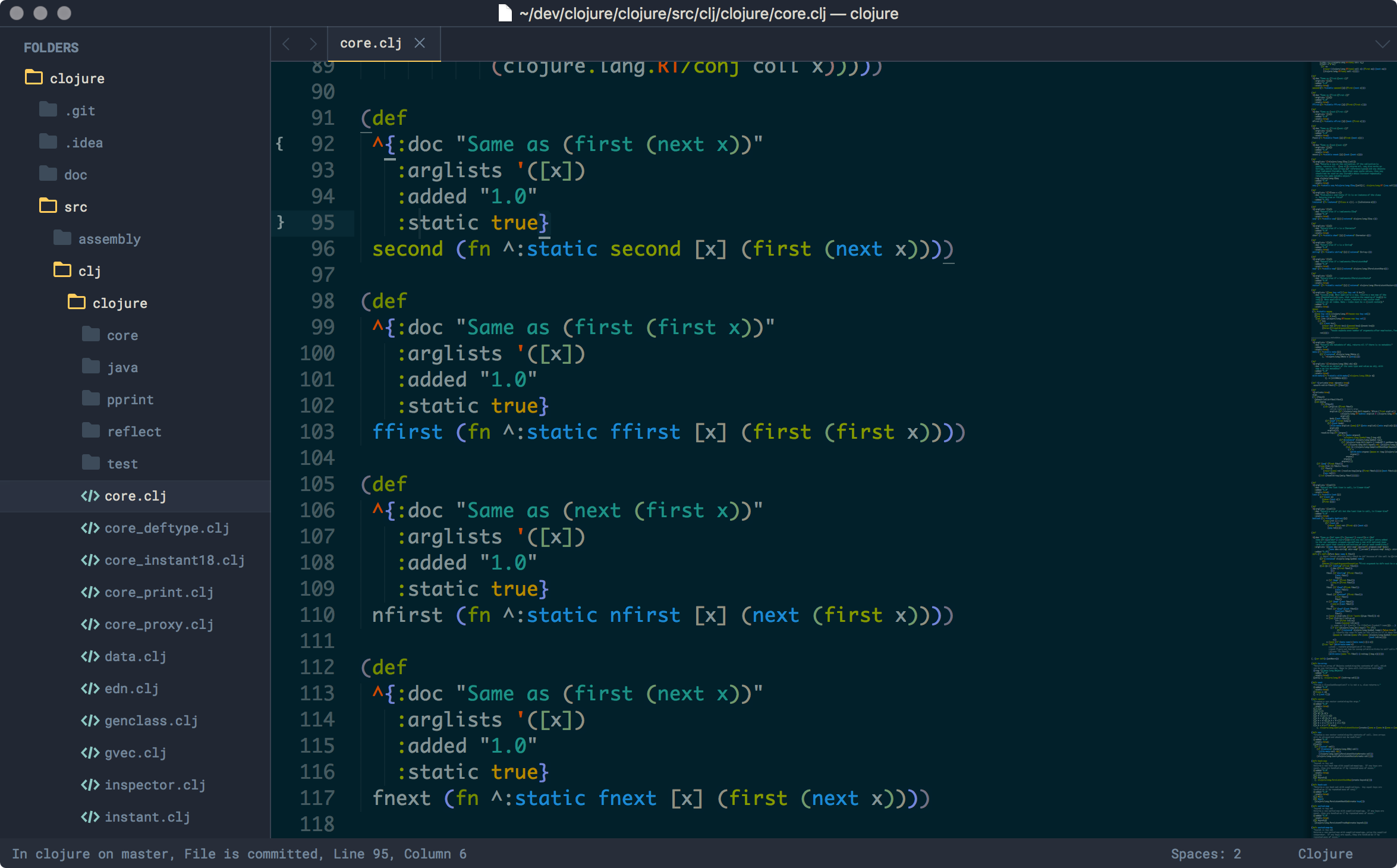
In this post we will have a sneak peak on using Sublime Text 3 for Clojure development. At this time there is no Emacs to cider type integration right from within Sublime Text.
1. Have Package Control installed.
2. Install bracket highlighter. Add the following config to the Sublime user settings, so that the bracket highlighter works properly and does not conflict with the editor's own matching.
{
    "auto_match_enabled": false,
    "match_brackets": false,
    "match_brackets_angle": false,
    "match_brackets_braces": false,
    "match_brackets_content": false,
    "match_brackets_square": false,
    "match_tags": false
}
This package will show the matched brackets in the gutter.
3. Install Rainbowth which will show colorful parenthesis. Once installed add the following palette in the path ~/Library/Application Support/Sublime Text 3/Packages/User/Rainbowth.sublime-settings which is taken from Emacs's package to make the highlighting easier on eyes when used in conjunction with Solarized Dark theme.
{
  "palettes": {
    "default": ["#707183", "#7388d6", "#909183", "#709870", "#907373", "#6276ba", "#858580", "#80a880", "#887070"]
  }
}
But Rainbowth needs to update the colour scheme so we need to do some extraction of the desired scheme. Let's say we are using Solarized Dark theme, then do the following.
cd "/Applications/Sublime Text.app"
mkdir -p ~/temp/subl

# Solarized theme is inside the legacy package
cp "Contents/MacOS/Packages/Color Scheme - Legacy.sublime-package" ~/temp/subl

# For some other themes which are not in the above, use
cp "Contents/MacOS/Packages/Color Scheme - Default.sublime-package" ~/temp/subl
cd ~/temp/subl && unzip "Color Scheme - Legacy.sublime-package"
cp "Solarized (Dark).tmTheme" ~/Library/Application\ Support/Sublime\ Text\ 3/Packages/
4. Add Clojure.sublime-settings in the same directory with the below contents so that by default, the source uses two spaces, which is the standard as per style guide and since we use `-` to separate words instead of camel case or `_`, the word separator helps us to easily select symbols with double click. Else, doing a double click on a word will select up to the separator.
{
    "tab_size": 2,
    "word_separators": "./\\()\"':,.;~!@#$%^&*|+=[]{}`~?"
}
5. Install sublime-lispindent (lispindent) plugin. Using ⌘+i will indent the selected region. Helps to maintain code style.
Theming
Next we can look into few enhancements and theming to make it easy on eyes. I generally prefer dark themes and tends towards Solarized Dark. While generally most articles say to use a lighter background with a darker text, it depends on various other conditions like the room lighting, and of course personal preference. Refer the Dark UI section of the post for citations.
1. Install Ayu colour scheme. We will be using Ayu Mirage with Solarized Dark theme. Add the following config under user settings.
{
    "color_scheme": "Packages/Solarized (Dark).tmTheme",
    "theme": "ayu-mirage.sublime-theme",
    "ui_big_tabs": false,
    "ui_fix_tab_labels": true,
    "ui_font_size_small": true,
    "ui_font_source_code_pro": true,
    "ui_separator": true,
    "ui_wide_scrollbars": true
}
2. Additional UI settings.
{
    "font_face": "Monaco",
    "font_options": [
        "subpixel_antialias"
    ],
    "font_size": 16,
    "gpu_window_buffer": true,
    "highlight_modified_tabs": true,
    "scroll_past_end": true,
    "show_full_path": true,
    "translate_tabs_to_spaces": true,
    "word_wrap": false
}
Other Enhancements
-
GitGutter to see source control changes.
-
SideBarEnhancements plugin which adds more options to the side bar right click menu.
-
EDN for Clojure EDN syntax highlighting.

Dark UI
[1] Negative contrast computer displays (dark letters on a light background) generally provide a more legible image than positive contrast displays (light letters on a dark background). Either black characters on a white background or white characters on a black background have been found to be more visible than green, yellow-orange, blue or red characters.
[2] The greatest difference among groups is on the black & white pair: while the majority of people without dyslexia prefer it (32.67%), only 13.64% of the participants with dyslexia chose black text on white background. Participants without dyslexia tend to prefer color pairs with a higher color and brightness contrast while people with dyslexia read faster when color pairs have lower contrasts. For instance, the color pair which was the fastest to read by the participants with dyslexia was black & creme (mean of 0.214 for the fixation duration) while black text over yellow background presents the largest fixation duration mean (0.239 seconds). Although the pair off-black & off-white is the one recommended in Web design for dyslexics (Bradford, 2011), none of the users with dyslexia selected it. This pair presents the highest fixation duration mean for the participants without dyslexia (0.193 seconds).
[3] Maureen did mention two situations when a dark background makes sense.However, if you are using a display in a dark environment, it’s better to use a dark background as it lets you keep your eyes dark adapted. That’s why controls for airplanes and GPS units for cars switch to a dark background at night. Usually, however, the results don’t look like symbols and text floating in the darkness of space…there’s still a sense of there being a dark surface to ground the view. So the concerns above are somewhat mitigated.
I’ve seen recommendations that white on black is better for aging eyes, and for people with low vision because it reduces the amount of light scattering and distorting the image.
[4] Chief among the reasons many of you have expressed for preferring dark backgrounds is the reduced strain placed on the eyes when staring at the screen for many hours. Many developers state that light text on a dark background is easier to read over longer periods of time than dark text on a light background.
Update on Tue, 30 Apr 24
Alternate Links
[1] The Effects of Computer Use on Eye Health and Vision - AOA